This is our film company logo, we choose the name Mise-en-power because of the important media term mise-en-scene and we the changed the word 'scene' to 'power'. This connotes that our company makes good quality films and the stars also connote this along with we are a big company. We decided to have one big star with little stars under the main writing to show that we can compete with other big film production companies and to suggest we create energetic films. The black writing is distinctive against the yellow of the stars in which promotes celebrity/stardom. This could also suggest danger like many of the caution signs there are, this would also fit in with our thriller genre as it could mean that the audience would be on edge watching our film.
Our tagline, "Giving energy to film" connotes that we are involved within the industry and that we think highly of the business. It also shows that we are always looking to improve and thrive to create fresh, new ideas within film. In addition, energy links in with the word power which is within our main company name.
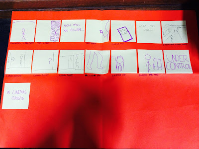
For our trailer we decided to use many different locations and to film at night or in the evening as this is a common feature of the genre because usually the dark is a fear of many people. This may be a problem though because filming at night could be complicated due to the low lighting so this will be a trial and error phase, if it doesn't work as well as we hope we can always change the lighting a little bit while editing or we will have to film during the day. The reason we have choose these locations is because they are normal everyday locations which connotes realism and therefore allows the audience to recognise them and connect with them. These are some of the settings we would like to use:
-Train station. This would be used for the ending of the trailer when Katie boards the train thinking she has escaped only to the audiences knowledge she hasn't as Owen too has gotten on the train. -Bedroom. This place would be used for when Katie and Chloe are talking about how controlling Owen is. -Dining room. This would be used for when Owen is shown to be under pressure from his parents because of his poor grades at school, the scene would end up with Owen storming off. We thought this would be good as it shows a multi-stranded narrative within the main plot. -Lounge. This would be used to show Owen and Chloe having a conversation. The main purpose of this scene would be to show the audience that Owen is controlling over Chloe. -Town. In this scene we would see Katie walking down an alley where Owen steps out in front of her to threaten her.
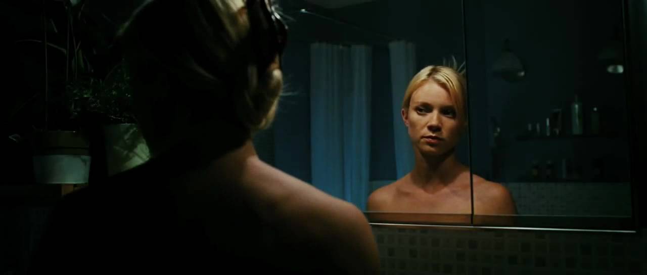
These characters are the main 3 in our film: Owen- Owen is a 17 year old male who is from a wealthy, upper class, privileged background and is under pressure from his parents to do well in life. Due to this he is also very controlling in relationships. Chloe- Chloe is a 17 year old female who is currently in a relationship with Owen. She is controlled by Owen but feels she cant tell anyone and is only still in the relationship because of the money he has and gifts he gets her. Katie- Katie is also a 17 year old female who is best friends with Chloe and unbeknownst to Chloe, she has been in a previous relationship with Owen. Most of the clothing we are going to use is fashionable and relevant to the present time as they are trendy up to date teenagers which connotes the realism within the film. Although Owen's outfit will most likely be dark (black or red) as he is the antagonist within the film, this is to show his characteristics and helps emphasise his build and makes him look more dominant. As for Katie she would probably wear red or a piece of red clothing as this does normally connote danger but because she is a damsel in distress type character it makes her stand out from the others and makes her look more attractive. We wont be using many props in our film because it is a psychological thriller so we are relying on the effect of suspense through the narrative. Props we will use is a phone to show the messages from one character to another which lets the audience know whats going on and maybe a mirror as this can show the darkness of a character and also makes the audience feel nervous and on edge.
We pitched our film trailer presentation to the class who gave feedback. Some of the feedback we got was that they were good ideas and that they could easily understand the narrative if they were to watch it. They also said that the conventions that we would use would be fitting to the thriller genre.
Some of the things we need to improve on is on furthering our ideas to include more sub plots which would make it multi-stranded. Things like interaction with pressure from parents and becoming an adult. This is so the audience doesn't get bored following just one plot.
These are some notes on the features and conventions used in the 1408 trailer:
Music - There is a voice-over used over the trailer to narrate the audience and give them vital information to whats going on, this is typical in many trailers. Also used is a 'woosh' sound effect during the cuts.
Intertitles - The trailer uses titles such as "Based on a true story" and the actors names. These can be used for general information like actors, directors and institutional information but also to create an sense of verisimilitude for the audience.
Editing - The editing starts off fairly slow but become faster paced towards the end, this is typical of many trailers and especially in thrillers or horrors, the editing also keeps up with the soundtrack and inter titles towards the end of the trailer.
Transitions - The trailer included a majority of fade to blacks and normal basic cuts, the fades are used to create tension for the audience.
Narrative/order - There is a multi stranded narrative within the trailer and it is in chronological order which is unusual for trailers as it can sometimes give too much of the plot away.
These are some film titles that we looked in class, specifically looking at the common conventions of them and also some uncommon features. We all quickly established that many if not all the titles are based on a black background with many also having red writing. The red writing connotes violence, gore and danger where the black background mainly connotes fear to go with peoples fear of the dark. The fonts are also very similar with many using the sans serif style, this is because many of the films unpleasant. The films are varied with some having longer style names like "The last house on the left" and "Before the devil knows you're dead" as these tend to be squashed together on the screen and then some with shorter names like "Seven" and "Sin City" which makes them more memorable for the audience.