Saturday, 19 December 2015

Film pitch


We pitched our film trailer presentation to the class who gave feedback. Some of the feedback we got was that they were good ideas and that they could easily understand the narrative if they were to watch it. They also said that the conventions that we would use would be fitting to the thriller genre. 

Some of the things we need to improve on is on furthering our ideas to include more sub plots which would make it multi-stranded. Things like interaction with pressure from parents and becoming an adult. This is so the audience doesn't get bored following just one plot.

Friday, 18 December 2015

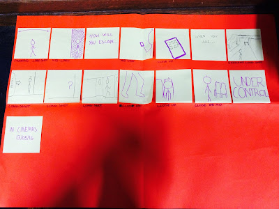
Storyboard - Planning


This is our final storyboard for the trailer with details on what type of shot each scene is and details on inter titles plus transitions. 

Wednesday, 16 December 2015

1408 trailer - Research


These are some notes on the features and conventions used in the 1408 trailer:

Music - There is a voice-over used over the trailer to narrate the audience and give them vital information to whats going on, this is typical in many trailers. Also used is a 'woosh' sound effect during the cuts. 

Intertitles - The trailer uses titles such as "Based on a true story" and the actors names. These can be used for general information like actors, directors and institutional information but also to create an sense of verisimilitude for the audience.

Editing - The editing starts off fairly slow but become faster paced towards the end, this is typical of many trailers and especially in thrillers or horrors, the editing also keeps up with the soundtrack and inter titles towards the end of the trailer. 

Transitions - The trailer included a majority of fade to blacks and normal basic cuts, the fades are used to create tension for the audience.

Narrative/order - There is a multi stranded narrative within the trailer and it is in chronological order which is unusual for trailers as it can sometimes give too much of the plot away. 


Tuesday, 15 December 2015

Film Titles - Research


These are some film titles that we looked in class, specifically looking at the common conventions of them and also some uncommon features. We all quickly established that many if not all the titles are based on a black background with many also having red writing. The red writing connotes violence, gore and danger where the black background mainly connotes fear to go with peoples fear of the dark. The fonts are also very similar with many using the sans serif style, this is because many of the films unpleasant. The films are varied with some having longer style names like "The last house on the left" and "Before the devil knows you're dead" as these tend to be squashed together on the screen and then some with shorter names like "Seven" and "Sin City" which makes them more memorable for the audience.

Friday, 11 December 2015

When a stranger calls - Research


These are some notes on the features and conventions used within "When a stranger calls" opening scene: 

Lighting - Low key lighting is used as this is common in thriller and horror films, the reason being is that it coincides with peoples fear of the dark. An example of this in the film is the poorly lit house which only has a few outside lights on. 

Camerawork - A juxtaposition is used in the opening, this is used to show the contrast between the bright fairground and the dull, poorly lit house. 

Music - Non diegetic music plays a big part in films and in this movie there is an example of when screams are used and the overall dark soundtrack over the opening. This eerie music is typical of the genre as it is used to unsettle the audience. There is also the diegetic sound of a phone at the start which builds suspense for the audience and also keeps them guessing because of the fear of the unknown. 

Setting - The start of the film is set in some kind of field where the fairground is placed, this can suggest isolation for some of the characters and to add to this, it is set at night which many people are fearful of. Stereotypical of the genre.

Editing - The editing in the film is varied throughout, at the start it is quite slow but then starts to pick up the pace. The editing becomes very inconsistent to make the audience feel on edge and slightly confused, the faster paced editing connotes some kind of terror or threat.  


Friday, 4 December 2015

Initial ideas - Planning


This first picture is a rough planning sheet were we all suggested ideas for our trailer from settings and locations to the narrative. 


This second picture is the more up to date version with more in depth planning on the plot, as it shows all the different connections the characters could possibly have. 


When we first started planning our film we wanted to go with something quite common and up to date that was based in the present day. We decided that we would use 3 main characters and involve them in some kind of triangle, with them all knowing each other and having been in previous relationships which each other in some way or another we thought this made it have more of a psychological edge. The idea for the overall narrative is loosely based of the T.V series "Catfish" and the film "Unfriended" which gave us our concept for the trailer. 

Thursday, 26 November 2015

Codes and Conventions of magazine front covers - Research


Before making my magazine front cover I decided that I should look at the codes and conventions of a magazine and what is covered on the front, although we had already done this earlier in the year and when creating our copy of the Total Film poster I thought that by looking at these again would give me better ideas for when making mine. 

These are some codes and conventions I believe should be on a magazine to ultimately create a successful magazine and eye catching front cover:

- The masthead, this is the title for the magazine and usually the main thing that will attract the reader.
- Strapline, this is subheading normally underneath the title which gives an insight to what may be inside the magazine.
- Heading, this is normally in the middle of the magazine front cover explaining what the main story of the magazine is about.
- Tag, very important on the front of the magazine as this invites the audience by using words such as plus, exclusive, new and special. 
- Pugs, these are used to grab the readers attention and usually placed in the corners of the magazines. Things like the prices, barcodes and logos are placed here.