Wednesday, 30 December 2015
Scripts - Planning
In our trailer we intend on not using any diegetic speech expect in only one scene which is when Owen is talking to his parents. This will only be a few words from his parents telling him about his poor grades and then Owen shouting something along the lines of "OK, whatever!" and walking out. We have decided on not using too much dialogue because we feel it creates and builds suspension for the viewers. With there being little dialogue it lets the audience establish there own mind up about the characters. There will be though non-diegetic music though which keeps the audience watching and also lets them understand what the trailer is about.
Music - Planning
For our trailer we are going to use two tracks throughout the whole thing. We wanted to use a fairly slow track at the start of a trailer, something classical or piano type music. This is because we want to ease in the audience from the start and not just chuck them straight into the deep end, by doing this it relaxes the audience and makes it easier for them to watch. This then sets up the rest of the narrative for the trailer. Then as the trailer advances it will start to pick up pace and become more serious, the music track will change and the beat will become progressively faster. This will be synchronous with the inter titles and transitions along with the soundtrack staying with the pace of the editing towards the end of the trailer, this feature will also build suspense. This is similar to the "1408" trailer. We have decided to use an "eerie" piece of music as it is a common convention of the genre and stereotypical so it makes it clear to the audience.
Updated - We have now since found music for our trailer, we used a website called free play music to pick a couple of tracks to go over our footage. The non diegetic track will be played at the start and then fade out for minimal dialogue then a second soundtrack will start to play. These are the tracks we have found for our film all by the composer Jason Bradley Livesay:
- Nightprowler
- Nightprowler (Reprise)
- Outbreak
- Wrongful Payback
Monday, 28 December 2015
Production company logo - Planning
Our tagline, "Giving energy to film" connotes that we are involved within the industry and that we think highly of the business. It also shows that we are always looking to improve and thrive to create fresh, new ideas within film. In addition, energy links in with the word power which is within our main company name.
Tuesday, 22 December 2015
Settings - Planning
For our trailer we decided to use many different locations and to film at night or in the evening as this is a common feature of the genre because usually the dark is a fear of many people. This may be a problem though because filming at night could be complicated due to the low lighting so this will be a trial and error phase, if it doesn't work as well as we hope we can always change the lighting a little bit while editing or we will have to film during the day. The reason we have choose these locations is because they are normal everyday locations which connotes realism and therefore allows the audience to recognise them and connect with them.
These are some of the settings we would like to use:
-Train station. This would be used for the ending of the trailer when Katie boards the train thinking she has escaped only to the audiences knowledge she hasn't as Owen too has gotten on the train.
-Bedroom. This place would be used for when Katie and Chloe are talking about how controlling Owen is.
-Dining room. This would be used for when Owen is shown to be under pressure from his parents because of his poor grades at school, the scene would end up with Owen storming off. We thought this would be good as it shows a multi-stranded narrative within the main plot.
-Lounge. This would be used to show Owen and Chloe having a conversation. The main purpose of this scene would be to show the audience that Owen is controlling over Chloe.
-Town. In this scene we would see Katie walking down an alley where Owen steps out in front of her to threaten her.
Sunday, 20 December 2015
Characters plus costumes/props - Planning
These characters are the main 3 in our film:
Owen- Owen is a 17 year old male who is from a wealthy, upper class, privileged background and is under pressure from his parents to do well in life. Due to this he is also very controlling in relationships.
Chloe- Chloe is a 17 year old female who is currently in a relationship with Owen. She is controlled by Owen but feels she cant tell anyone and is only still in the relationship because of the money he has and gifts he gets her.
Katie- Katie is also a 17 year old female who is best friends with Chloe and unbeknownst to Chloe, she has been in a previous relationship with Owen.
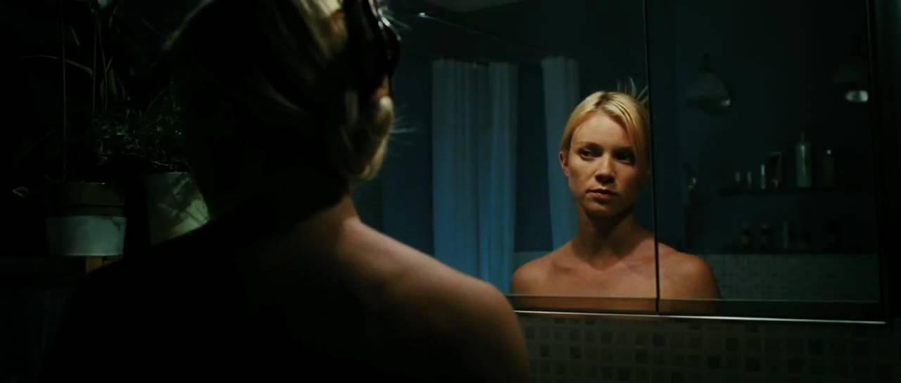
Most of the clothing we are going to use is fashionable and relevant to the present time as they are trendy up to date teenagers which connotes the realism within the film. Although Owen's outfit will most likely be dark (black or red) as he is the antagonist within the film, this is to show his characteristics and helps emphasise his build and makes him look more dominant. As for Katie she would probably wear red or a piece of red clothing as this does normally connote danger but because she is a damsel in distress type character it makes her stand out from the others and makes her look more attractive. We wont be using many props in our film because it is a psychological thriller so we are relying on the effect of suspense through the narrative. Props we will use is a phone to show the messages from one character to another which lets the audience know whats going on and maybe a mirror as this can show the darkness of a character and also makes the audience feel nervous and on edge.
Saturday, 19 December 2015
Film pitch
We pitched our film trailer presentation to the class who gave feedback. Some of the feedback we got was that they were good ideas and that they could easily understand the narrative if they were to watch it. They also said that the conventions that we would use would be fitting to the thriller genre.
Some of the things we need to improve on is on furthering our ideas to include more sub plots which would make it multi-stranded. Things like interaction with pressure from parents and becoming an adult. This is so the audience doesn't get bored following just one plot.
Friday, 18 December 2015
Storyboard - Planning
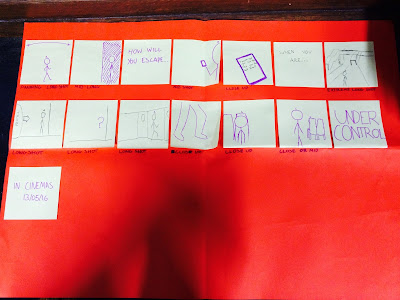
This is our final storyboard for the trailer with details on what type of shot each scene is and details on inter titles plus transitions.
Wednesday, 16 December 2015
1408 trailer - Research
These are some notes on the features and conventions used in the 1408 trailer:
Music - There is a voice-over used over the trailer to narrate the audience and give them vital information to whats going on, this is typical in many trailers. Also used is a 'woosh' sound effect during the cuts.
Intertitles - The trailer uses titles such as "Based on a true story" and the actors names. These can be used for general information like actors, directors and institutional information but also to create an sense of verisimilitude for the audience.
Editing - The editing starts off fairly slow but become faster paced towards the end, this is typical of many trailers and especially in thrillers or horrors, the editing also keeps up with the soundtrack and inter titles towards the end of the trailer.
Transitions - The trailer included a majority of fade to blacks and normal basic cuts, the fades are used to create tension for the audience.
Narrative/order - There is a multi stranded narrative within the trailer and it is in chronological order which is unusual for trailers as it can sometimes give too much of the plot away.
Tuesday, 15 December 2015
Film Titles - Research
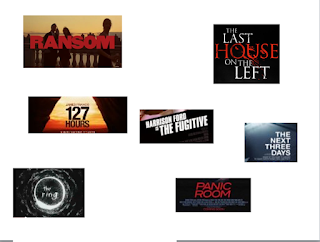
These are some film titles that we looked in class, specifically looking at the common conventions of them and also some uncommon features. We all quickly established that many if not all the titles are based on a black background with many also having red writing. The red writing connotes violence, gore and danger where the black background mainly connotes fear to go with peoples fear of the dark. The fonts are also very similar with many using the sans serif style, this is because many of the films unpleasant. The films are varied with some having longer style names like "The last house on the left" and "Before the devil knows you're dead" as these tend to be squashed together on the screen and then some with shorter names like "Seven" and "Sin City" which makes them more memorable for the audience.
Friday, 11 December 2015
When a stranger calls - Research
These are some notes on the features and conventions used within "When a stranger calls" opening scene:
Lighting - Low key lighting is used as this is common in thriller and horror films, the reason being is that it coincides with peoples fear of the dark. An example of this in the film is the poorly lit house which only has a few outside lights on.
Camerawork - A juxtaposition is used in the opening, this is used to show the contrast between the bright fairground and the dull, poorly lit house.
Music - Non diegetic music plays a big part in films and in this movie there is an example of when screams are used and the overall dark soundtrack over the opening. This eerie music is typical of the genre as it is used to unsettle the audience. There is also the diegetic sound of a phone at the start which builds suspense for the audience and also keeps them guessing because of the fear of the unknown.
Setting - The start of the film is set in some kind of field where the fairground is placed, this can suggest isolation for some of the characters and to add to this, it is set at night which many people are fearful of. Stereotypical of the genre.
Editing - The editing in the film is varied throughout, at the start it is quite slow but then starts to pick up the pace. The editing becomes very inconsistent to make the audience feel on edge and slightly confused, the faster paced editing connotes some kind of terror or threat.
Friday, 4 December 2015
Initial ideas - Planning
This first picture is a rough planning sheet were we all suggested ideas for our trailer from settings and locations to the narrative.
This second picture is the more up to date version with more in depth planning on the plot, as it shows all the different connections the characters could possibly have.
When we first started planning our film we wanted to go with something quite common and up to date that was based in the present day. We decided that we would use 3 main characters and involve them in some kind of triangle, with them all knowing each other and having been in previous relationships which each other in some way or another we thought this made it have more of a psychological edge. The idea for the overall narrative is loosely based of the T.V series "Catfish" and the film "Unfriended" which gave us our concept for the trailer.
Thursday, 26 November 2015
Codes and Conventions of magazine front covers - Research
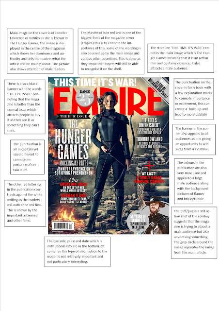
Before making my magazine front cover I decided that I should look at the codes and conventions of a magazine and what is covered on the front, although we had already done this earlier in the year and when creating our copy of the Total Film poster I thought that by looking at these again would give me better ideas for when making mine.
These are some codes and conventions I believe should be on a magazine to ultimately create a successful magazine and eye catching front cover:
- The masthead, this is the title for the magazine and usually the main thing that will attract the reader.
- Strapline, this is subheading normally underneath the title which gives an insight to what may be inside the magazine.
- Heading, this is normally in the middle of the magazine front cover explaining what the main story of the magazine is about.
- Tag, very important on the front of the magazine as this invites the audience by using words such as plus, exclusive, new and special.
- Pugs, these are used to grab the readers attention and usually placed in the corners of the magazines. Things like the prices, barcodes and logos are placed here.
Wednesday, 18 November 2015
What makes us scared?
During many lessons we studied the code and conventions of thriller plus some horror trailers to help us understand what these imply and suggest to an audience. We started by noting and listing certain aspects of what make a thriller film, things such as the setting would normally be at night so it would be dark, raining, urban areas or quite places. Their would also be quite alot of non diegetic music throughout the film to create suspense while alongside this being fast paced editing. The narrative would be based around the investigation of an enigma which would create the sense of confusion for the audience while it also being realistic to keep the viewers on edge because they know in the back of their mind that something like whats happening in the film could potentially happen to them. It also stays in their thoughts after watching the film which leads them to tell friends and family what happened in it eventually leading them too to watch the film. The plot would normally have a hero (male) which is usually the only one to solve the mystery and reveal the truth while also having a damsel in distress type victim.
Adding to this we listed common fears of people in the lesson, these fears ranged from the dark, the unknown, heights, small confined spaces and ultimately dying. These fears are always put into thrillers to directly affect the audience and get into their head.
Friday, 6 November 2015
Wednesday, 28 October 2015
The Exorcism of Emily Rose trailer - Research
Low key lighting
Film Language: Camera movement, editing, sound effects
Heavy breathing - diegetic, synchronous
Non-diegetic choir - links to priest
Fast pace build up from middle to end
Mid shot of face
Structure: What do you see first? What do you see last? How much of the film do you see? Narration at start (voice over)
Picked up pace towards the end
Advertising techniques: How is the film advertised? Based on a true story
Audience: Who is the film aimed at? How do you know? Adults (15 age rating) - Predominantly male viewers but maybe female because main character is of that gender.
International audience
Effect: Does this make you want to see the film? Why or why not?
Trailer doesn't give too much away so leaves you wanting more.
Fast paced editing makes the audience feel tense.
Non-diegetic music effective because it creates suspense.
How many shots in total? How long is it? 85 to 95, 1:59 minutes long
How many characters and narratives?
Emily Rose
Mother
Father
Priest
Detective
Roommate
Judge
Doctor
How many settings? House (bedroom and kitchen), Alleyway, Jail cell, Park, Court, Church, School, Field, Barn and Street.
How many music tracks/sound effects? What are they like? Low string music
Vocals - high pitch and low pitch (like a church choir)
Screeches - Low to high to low
Bells, church chime
How many inter titles? What information is on them? 4-5 Basic description of story eg. Based on a true story
Tuesday, 22 September 2015
Se7en film - Research
Seven is a 1995 crime-thriller film directed by David Fincher which stars notable actors and actresses from Brad Pitt and Morgan Freeman to Gwyneth Paltrow and Kevin Spacey. The film is about two detectives who work on homicide trying to track down a serial killer who chooses his victims according to the seven deadly sins, together they trace the killers steps only unaware that they become too involved in which leads to an unpredictable climax.Characters: Detective Somerset Detective Mills Detective Taylor Tracy Officer Davis John Doe
Settings: City, Apartment, Police precinct, Deserted wasteland.
Common conventions used: Low key lighting throughout, especially the crime scenes, one example is of the polaroid's being hang in a red room which signifies danger. City weather always raining or overcast to connote the depressive mood. Non diegetic music in important scenes to emphasise the suspension/tension and the use of amplified thunder to make the audience feel frightened and on edge. Overall slow/tense story build up, this makes for a powerful and climatic ending.
Narrative: The film follows rookie detective David Mills (Brad Pitt) on his transfer to an unidentified city where he is partnered with detective William Somerset (Morgan Freeman) whom is on the verge on retiring. The two investigate a case of a deadly serial killer where Mills' wife, Tracy (Gwyneth Paltrow) realises the two aren't getting on so she invites Somerset over to dinner to where they discuss the case further. After a couple of days Tracy arranges to meet with Somerset where she tells him she's miserable in the city and that she's pregnant. Later that day they track down the villains apartment whey they get into a stand off with the killer, named John Doe (Kevin Spacey). Mills gets held at gunpoint by Doe but is eventually let go, Doe contacts the detectives congratulating them on finding him and that he admires detective Mills. After two more killings Doe confronts the two detectives in the police precinct covered in blood, he offers a deal with them that he'll confess to the murders if he can take them to the last two bodies. Wanting a confession the detectives agree. During the prep Mills tries to tell Somerset that he has some concern with the unknowingly pregnant Tracy but cant bring himself around to tell him. The three travel to a desert wasteland on the outskirts of the city where Doe points them towards a specific spot, the men step out. After a few moments a van arrives down the desert road where Somerset flags it down and orders it to stop, the driver claims he was paid to deliver a package for Mills at this exact place at this exact time. Somerset opens the box in horror of what he sees, while running back to Mills telling him to put his gun down Doe states that he was envious of Mills' wife and that he tried to "play husband" with her but it didn't go to plan so he took a souvenir instead. "Her pretty head". Doe's plan all along was for himself to be killed. After telling him that she was pregnant and begged for her life and more importantly her unborn child's life Mills' anger gets the better of him and he fires off multiple shots into Doe's body completing the seven sins and Doe's plan.

Sunday, 30 August 2015
Film posters - Research
The film poster shown here is Batman: The Dark Knight and other one below is The Hunger Games: Mockingjay Part 1. One convention of the two film posters is that the main character is displayed in the the middle of the page, this is to show the audience who the main character will be in the film and to understand some sort of narrative. They also do this to portray that the character has dominance to whom is normally the protagonist in the film. Another similar item is the use of fire on a dark low key lighting background, the two posters do this so the viewer is immediately drawn to the fire which connotes destruction, anger and passion. This is also done because of the genre of the film which is Action and Adventure.
An additional feature on many film posters including these two is that they are normally very minimalist and don't offer a lot on the poster. Some of the most common features on a film poster are a slogan, the title, main image of a character, actors and actresses names
cast and crew information (billing block), release date and reviews. Commonly the information is at the bottom of the poster so the audience are attracted to the main image which is the main focus. As seen on both of these posters the title, billing block and release date are at the bottom of the page. The slogan off the Batman poster "Welcome to a world without rules" engages the reader straight away as it connotes danger therefore making the audience think about what could potentially happen in the film then leading to them wanting to watch it.
Tuesday, 25 August 2015
Film magazine covers - Research
 How is the film front cover laid out on a magazine?
On the right is a film magazine cover from 'Empire' which is the The Dark Knight Rises. First of all is that the image of Batman takes up most of the cover in the middle suggesting that it is the main piece in the magazine but also covers up the masthead Empire which is in red. Being in red, it catches the readers attention straight away, this is done specifically on a dark background to show this affect. The picture partly covers up the masthead head but this doesn't matter as Empire is well know and most people automatically know what it is. The film title itself is placed in the bottom left hand corner in white bold writing again attracting the readers attention on the dark background. Usually the film titles will be placed in the middle of the cover but Empire have cleverly placed it in the corner knowing that it will still attract the reader because of the contrasting colours. At the top there is an exclusive reading the ultimate exclusive in capitals and the first two words in yellow and last in white. On the left hand side of the page there is things related to the main film like on set pictures and talks with the director, this is in yellow writing and inside a yellow box suggesting it could be exclusive to the magazine therefore attracting more people to buy the magazine. On the right side of the cover there are names of actors and actresses along with reviews of other films, all of this is split up into baby blue and white colours, proposing that it is mainly a male target audience. The writing is also notably smaller than the rest on the magazine connoting its less of importance but still a feature to attract a wider range of readers.
Who is the target audience? How do I know?
The target audience of this magazine cover is mainly aimed towards males of the age between 16-25 as the the films being advertised are all of the same genre which is action and adventure. This is shown by the main film being advertised The Dark Knight Rises but also the other films on the cover like Skyfall and the text in the corner reading 'This year's best films fights, sex scenes in jokes and more!' This suggests that it may contain some mature content and again aimed towards males. Also the colours on the magazine are very dark and masculine, the red and white writing on a dark background demonstrates that Empire have directed towards a large male audience.
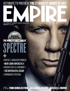 How is the film front cover laid out on a magazine?
On the left is a film magazine cover from 'Empire' which is the Spectre. The image on the cover is of James Bond also known as 007 which covers nearly the entire page again suggesting that its the center piece of the magazine with the masthead at the top but unlike the norm with Empire the masthead goes over the image instead of behind it. Empire is written in white which is a very neutral colour, maybe suggesting that the magazine is intended for both genders. The title of the film Spectre is on the left in unusually smaller writing than normal and in a pale blue colour to fit Bond's shirt, The colours of the rest of magazine are in the pale blue and white on a dark background. On the rest of the magazine there is a TV preview at the top above the masthead and many films advertised on the left, The films on the left look to target mainly a male audience. There is also a puff with Bond is back within it and underneath stating 'the worlds first look at' in capitals. Finally at the bottom there is a list of actors and actresses to wider the range of audiences.
Who is the target audience? How do I know?
The target audience for this magazine is mainly males of about the age of 18-28, i believe that the target audience age is this because the cover is very neutral and mature suggesting that its aimed towards adults. There are no bright colours to really attract younger readers. The films advertised on the right also suggest that its aimed towards a male genre like Fast and Furious 7, Fantastic 4 and Jurassic World, Stereotypically these types of films are aimed towards males and not females. The picture of Bond is of him holding a gun which again suggests that Empire are not aiming it towards women as violent films are stereotypically focused towards males. Finally the colours are very neutral which can cause confusion to what gender its directed at but ultimately i believe that Empire has targeted a male audience.
Saturday, 8 August 2015
Black Pond - Research
Black Pond is the film trailer we were given to watch, the film is an low budget independent British film who is directed by Tom Kingsley and Will Sharpe, It was nominated for a BAFTA in 2012 for outstanding British Debut Award and stars controversial actor Chris Langham and Simon Anstell.
Number of shots: 90
Length of the trailer: 2:02
Characters: Tom Thompson
Eric Sacks
Sophie Thompson
Blake
Tim Tanaka
Katie Thompson
Jess Thompson
Narrative: A family and friend are accused of murder when a guest dies at dinner.
Settings: Total of 8 settings, House (kitchen, dining room, bedroom etc)
Car
Bridge
Forest
Swimming pool
Beach
Party
City
Music tracks/effects: A slow piano tune at the start is used to connote danger and fear, this also leaves the viewer guessing and in suspense, a doorbell sound effect then interrupts the music but instantly the piano music starts up again in more of an upbeat tune. A violin is also used during this piece. The track used here is Will Sharpe - Dream Song. Halfway through the trailer another song is used again with a piano to start it off but quite monotone this time and again some sort of violin or chello is used, the beat stays the same throughout connoting grief and sadness. This song is Will Sharpe - The Most Beautiful Thing I've Ever Done.
Number of inter titles: 6 (White Arial styled font on a green submerged pond to connect name of the film) First 2 inter titles narrating part of the story so the reader knows what's happening, 3rd inter title is the name of the film, the next 2 are the names of actors crediting them with awards and the finally the last inter title is the full cast and crew information.
What makes a good film trailer?
I believe that a good film trailer is made up mainly of a good piece of music or multiple pieces of music/sound effects, i think that without this a film trailer can be really lacking quality although without a doubt it also needs a narrative which people can understand and follow, good actors and actresses, its needs moments of epic proportion or climatic moments depending on the genre of the film and a cliff hanger for people wanting more.
Friday, 3 July 2015
Subscribe to:
Comments (Atom)


![IMG_0237[1]](http://mediablog.longsands-academy.org/wp-content/uploads/2015/11/IMG_02371-300x225.jpg)
![IMG_0235[1]](http://mediablog.longsands-academy.org/wp-content/uploads/2015/11/IMG_02351-300x225.jpg)
![IMG_0265[1]](http://mediablog.longsands-academy.org/wp-content/uploads/2015/11/IMG_02651-300x225.jpg)


