Sunday, 30 August 2015

Film posters - Research


The film poster shown here is Batman: The Dark Knight and other one below is The Hunger Games: Mockingjay Part 1. One convention of the two film posters is that the main character is displayed in the the middle of the page, this is to show the audience who the main character will be in the film and to understand some sort of narrative. They also do this to portray that the character has dominance to whom is normally the protagonist in the film. Another similar item is the use of fire on a dark low key lighting background, the two posters do this so the viewer is immediately drawn to the fire which connotes destruction, anger and passion. This is also done because of the genre of the film which is Action and Adventure. 

An additional feature on many film posters including these two is that they are normally very minimalist and don't offer a lot on the poster. Some of the most common features on a film poster are a slogan, the title, main image of a character, actors and actresses names
cast and crew information (billing block), release date and reviews. Commonly the information is at the bottom of the poster so the audience are attracted to the main image which is the main focus. As seen on both of these posters the title, billing block and release date are at the bottom of the page. The slogan off the Batman poster "Welcome to a world without rules" engages the reader straight away as it connotes danger therefore making the audience think about what could potentially happen in the film then  leading to them wanting to watch it. 

Tuesday, 25 August 2015

Film magazine covers - Research


How is the film front cover laid out on a magazine?
On the right is a film magazine cover from 'Empire' which is the The Dark Knight Rises. First of all is that the image of Batman takes up most of the cover in the middle suggesting that it is the main piece in the magazine but also covers up the masthead Empire which is in red. Being in red, it catches the readers attention straight away, this is done specifically on a dark background to show this affect. The picture partly covers up the masthead head but this doesn't matter as Empire is well know and most people automatically know what it is. The film title itself is placed in the bottom left hand corner in white bold writing again attracting the readers attention on the dark background. Usually the film titles will be placed in the middle of the cover but Empire have cleverly placed it in the corner knowing that it will still attract the reader because of the contrasting colours. At the top there is an exclusive reading the ultimate exclusive in capitals and the first two words in yellow and last in white. On the left hand side of the page there is things related to the main film like on set pictures and talks with the director, this is in yellow writing and inside a yellow box suggesting it could be exclusive to the magazine therefore attracting more people to buy the magazine. On the right side of the cover there are names of actors and actresses along with reviews of other films, all of this is split up into baby blue and white colours, proposing that it is mainly a male target audience. The writing is also notably smaller than the rest on the magazine connoting its less of importance but still a feature to attract a wider range of readers. 

Who is the target audience? How do I know? 
The target audience of this magazine cover is mainly aimed towards males of the age between 16-25 as the the films being advertised are all of the same genre which is action and adventure. This is shown by the main film being advertised The Dark Knight Rises but also the other films on the cover like Skyfall and the text in the corner reading 'This year's best films fights, sex scenes in jokes and more!' This suggests that it may contain some mature content and again aimed towards males. Also the colours on the magazine are very dark and masculine, the red and white writing on a dark background demonstrates that Empire have directed towards a large male audience. 

How is the film front cover laid out on a magazine?
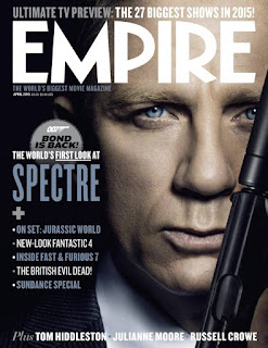
On the left is a film magazine cover from 'Empire' which is the Spectre. The image on the cover is of James Bond also known as 007 which covers nearly the entire page again suggesting that its the center piece of the magazine with the masthead at the top but unlike the norm with Empire the masthead goes over the image instead of behind it. Empire is written in white which is a very neutral colour, maybe suggesting that the magazine is intended for both genders. The title of the film Spectre is on the left in unusually smaller writing than normal and in a pale blue colour to fit Bond's shirt, The colours of the rest of magazine are in the pale blue and white on a dark background. On the rest of the magazine there is a TV preview at the top above the masthead and many films advertised on the left, The films on the left look to target mainly a male audience. There is also a puff with Bond is back within it and underneath stating 'the worlds first look at' in capitals. Finally at the bottom there is a list of actors and actresses to wider the range of audiences. 

Who is the target audience? How do I know? 
The target audience for this magazine is mainly males of about the age of 18-28, i believe that the target audience age is this because the cover is very neutral and mature suggesting that its aimed towards adults. There are no bright colours to really attract younger readers. The films advertised on the right also suggest that its aimed towards a male genre like Fast and Furious 7, Fantastic 4 and Jurassic World, Stereotypically these types of films are aimed towards males and not females. The picture of Bond is of him holding a gun which again suggests that Empire are not aiming it towards women as violent films are stereotypically focused towards males. Finally the colours are very neutral which can cause confusion to what gender its directed at but ultimately i believe that Empire has targeted a male audience.

Saturday, 8 August 2015

Black Pond - Research


Black Pond is the film trailer we were given to watch, the film is an low budget independent British film who is directed by Tom Kingsley and Will Sharpe, It was nominated for a BAFTA in 2012 for outstanding British Debut Award and stars controversial actor Chris Langham and Simon Anstell. 

Number of shots: 90

Length of the trailer: 2:02

Characters: Tom Thompson
                     Eric Sacks
                     Sophie Thompson
                     Blake
                     Tim Tanaka
                     Katie Thompson
                     Jess Thompson

Narrative: A family and friend are accused of murder when a guest dies at dinner. 

Settings: Total of 8 settings, House (kitchen, dining room, bedroom etc)
                                               Car 
                                               Bridge 
                                               Forest
                                               Swimming pool
                                               Beach 
                                               Party 
                                               City

Music tracks/effects: A slow piano tune at the start is used to connote danger and fear, this also leaves the viewer guessing and in suspense, a doorbell sound effect then interrupts the music but instantly the piano music starts up again in more of an upbeat tune. A violin is also used during this piece. The track used here is Will Sharpe - Dream Song. Halfway through the trailer another song is used again with a piano to start it off but quite monotone this time and again some sort of violin or chello is used, the beat stays the same throughout connoting grief and sadness. This song is Will Sharpe - The Most Beautiful Thing I've Ever Done.  

Number of inter titles: 6 (White Arial styled font on a green submerged pond to connect name of the film) First 2 inter titles narrating part of the story so the reader knows what's happening, 3rd inter title is the name of the film, the next 2 are the names of actors crediting them with awards and the finally the last inter title is the full cast and crew information. 

What makes a good film trailer? 
I believe that a good film trailer is made up mainly of a good piece of music or multiple pieces of music/sound effects, i think that without this a film trailer can be really lacking quality although without a doubt it also needs a narrative which people can understand and follow, good actors and actresses, its needs moments of epic proportion or climatic moments depending on the genre of the film and a cliff hanger for people wanting more.